Behind every successful website, there are a multitude of factors that play a deciding role. One such range of factors are the visual elements that you use on your website. One of the most quoted sayings as it goes, "first impression is the last impression," holds for everything and everyone in this world.
In the same way a website's success and the traffic it attracts, everything depends on the first impression of your website on the people. Visual elements are the factors or, say, elements that add up to form the user interface of a website. Some of these visual elements might seem basic but play a crucial role in deciding the look and feel of your website.
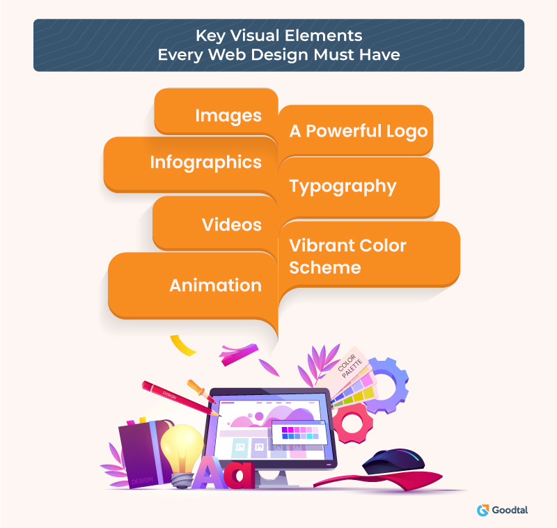
In this post, we'll be discussing seven such elements that add up to making a perfect web design. Adding these visual elements to your website can help you create an interactive web design that builds a long-lasting impression on the users. So, let's move forward and check these seven visual elements that every web designer should know about.
What Are Visual Elements, and Why Should They Be Added to Websites?
Visual elements are those components or tools that web designers use to improve the looks of the website. Adding these elements correctly and in sufficient quantities can help create fun and interactive web designs that guarantee visitor engagement and improve social media presence.
Another reason why adding visual elements is a must is because they help improve the SEO ranking and SERP results of the website by contributing to improving its overall quality. Visual elements can improve not only the website's looks but also the website's screen reader accessibility, making it accessible for even visually impaired people. Let's discuss these visual elements in more detail and the way websites benefit.
Top Visual Elements Every Website Must Have

#1 Typography
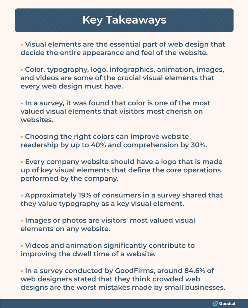
Typography refers to the art of arranging text and letters in a way that makes the content appear more transparent and easily understandable. It also helps build a hierarchy among the content that can be easily picked and understood by screen readers thus improving the website's screen reader accessibility. According to Hubspot, 19% of consumers consider typography a visual element they value on a website.
Typography involves shaping the content of the website in a manner that improves its comprehensibility and clarity. Elements like fonts, font color, font size, etc., represent typography and greatly help make the content look more appealing and clearer.
It's evident that people only stay on websites where gathering knowledge seems easier than those that look too ambiguous. Hence prioritizing typography while designing the website can greatly benefit in bringing higher traffic to the website.
#2 Solid Logo
A logo is an element that gives a unique identity to your business. It represents your business, and whenever people look at it, it reminds them of your business. Hence it's essential to value your logo as a visual element that designers must put on a brand's website.
The logo needs to be unique, crafted with much thinking, and contain elements that are key to your business to improve brand recognition. A logo represents your business, and hence it needs to be placed at the right place on your business website where it's easily visible.
#3 Vibrant Colors/Color Scheme
Colors are something that, when put in the right amount and proper contrast, can make everything look beautiful. According to a survey, around 39% of consumers felt that color was one of the most essential visual elements they value on a website. Hence, designers need to work on colors or say the color scheme for the website very carefully.

The color scheme is a crucial visual element, but at the same time, it should be handled and crafted with much care and attention. This is because too much use of colors and incompatible color schemes can make your website look too bright at a point that they hurt the eyes or, in some cases, make the website look too uninteresting and dull.
Another survey found that color can help improve website readership by up to 40% and comprehension by 73%. Hence it is crucial to value color scheme as one of the most potent visual elements that can add up to form a beautiful web design.
#4 Infographics
Infographics are one of the most powerful visual elements that make websites appear more interactive and knowledge-rich. Infographics are a rich source of information that contain visual illustrations along with texts that make the content easier to grasp. Infographics have proven to be very attention-drawing as well as highly shareable.
The same survey mentioned that approximately 15% of consumers value infographics as one of the most crucial visual elements. Infographics may contain graphs, charts, images, etc., to explain and present the information more interactively.
In some cases, infographics are self-explanatory, don’t require texts like images do in blogs, and can be published separately. Meanwhile, they can also be added to a blog and published as a part of it. Irrespective of how they are published, infographics hold a handful of knowledge and are cherished by audiences.
#5 Animation
Animation is one of the most creative ways of expressing an opinion. In the survey, it was among the top six visual elements most valued by visitors on the website; approximately 12% said that animation is a crucial element. Animations are cherished by the population of every age group, whether children, adults, or senior citizens.
Animation is most suitable for educational blogs as it can offer powerful media for conveying information to kids in a more fun way. It helps website visitors understand the content of the blog faster and in a more fun way. Moreover, animation makes websites look more interactive and beautiful. It can be in any form, a GIF or a small illustrative video.
#6 Images
Images are again one of the most significant visual elements and were listed as the most valued elements by approximately 40% of respondents. In the survey, images and photos were among the most valued visual elements available. Unlike animation and videos, images are easy to prepare and take less time and cost.
Adding images to the blog to explain critical topics and points is a great practice that makes the content comprehensible. Moreover, it becomes more memorable when you explain your point through images rather than words. It also improves your website's credibility and looks and makes them look more professional on all fronts.
#7 Videos
Next to images, videos are amongst the most valued visual elements on websites. Adding videos has multiple perks for the website as well as the visitors. It makes information easier to digest and more relatable. Moreover, it has proven to be a more effective tool for improving social media engagement and users' dwell time.
Dwell time is the time users spend on a particular website, and higher dwell time leads to more benefits for the website owners, and videos are the best way to do so. These videos must be straight to the point and explain the concept more easily and in a fun way.
Adding videos to your website content is also beneficial from the SEO perspective. Google not only ranks websites based on keywords but also based on quality. Adding excellent knowledge-rich videos effectively showcases the quality of websites and hence can boost your website ranking and thus its position on SERP results.
How Many Visual Elements Are Too Many?
Visual elements help improve the look and feel of your website and have proven to be great tools for boosting social media and audience engagement. But as there is a limit to everything for visual elements, too, there is a limit; adding them beyond an optimal limit makes the web design crowded. It can end up making the web design more confusing and content incomprehensible.
In a survey by GoodFirms, conducted on web designers, it was found that around 84.6% of them believed that crowded web design is one of the most common and worst mistakes made by small businesses. Hence it is advisable to use only enough visual elements that are necessary and enough to form a perfect web design.
There is no limit on how many images, videos, or infographics, what colors, and how many of them should be used on websites. It all depends on the designer, the type of content, and its length. According to Neil Patel, it is a best practice to add images after every 150 words, and the same goes for other elements like videos.
Wrapping Up
A perfect web design is a cornerstone to a robust and successful website. Visual elements are one of the most potent and effective tools for building beautiful, interactive websites. In this post, we discussed seven of the best and most important visual elements that, when used correctly, can add up to form a perfect web design.
These visual elements help improve website readability and comprehensibility to a great extent. Adding videos, photos, infographics, and animations is a great way of creating fun and interactive content that helps increase the website's audience engagement and dwell time.

